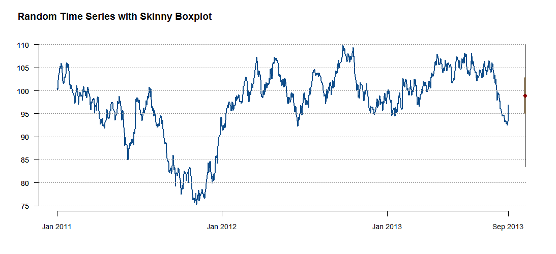
The Skinny Boxplot
14 Dec, 2013 — 3 minOften when I look at a time series chart I want to know more about the distribution of the data. Sometimes it seems like the pattern jumps out at you but other times it’s hard to tell where the median is or how skewed the data is. I have gotten into the habit of putting a box plot next to the time series, but found that this was hard to do in R. I wanted a minimalist look taking up as little space as possible next to the end of the time series, and my efforts to use two charts in the same area came up short.
I’ve spent a lot of time looking at klr’s awesome work at Timely Portfolio on charting data (among other cool things) and based this off of what I gained there. After trying several routes I ended up creating a “skinny” boxplot by using a custom panel function in the xtsExtra package. I like this modification that looks like a right hand axis but is really a small box plot:
xtsExtra is has a lot of nice capabilities, and the custom panel adds even more. In this case the key was to figure out the x-axis location. Here is the code for the chart:
require(xtsExtra)

# Create a random time series as an xts object
set.seed(13)
out <- xts(100+cumsum(rnorm(1000)), order.by=(as.Date("2010-12-31")+1:1000))

# Custom panel with with skinny boxplot
custom.panel.sbp <- function(index,x,...) {
  default.panel(index,x,...)
  # horizontal lines (thanks to klr for the following 2 lines of code)
  abline(h=pretty(c(par("yaxp")[1],par("yaxp")[2]),n=par("yaxp")[3]),col="gray60",lty=3)
  # lhs axis (side 2)
  axis(side=2,col="gray60",col.axis="black",lwd=0,lwd.ticks=FALSE,las=1,
  at=pretty(c(par("yaxp")[1],par("yaxp")[2]),n=abs(par("yaxp")[3])),
  labels=pretty(c(par("yaxp")[1],par("yaxp")[2]),n=abs(par("yaxp")[3])))

  # Skinny box-whisker plot in RHS margin lines are 1.5 x IQR
  # par("usr") = gives extremes of the user coordinates of the plotting region
  # far dimension - 0.25% x (far - near) puts the plot near the end of
  # the horizontal lines
  rt.base <- par("usr")[2] - 0.003 * (par("usr")[2] - par("usr")[1])
  lines(rep(rt.base, 2),
  c(max(min(x), quantile(x, 0.25) - 1.5 * (quantile(x, 0.75)-quantile(x, 0.25))),
  min(max(x), quantile(x, 0.75) + 1.5 * (quantile(x, 0.75)-quantile(x, 0.25)))),
  lwd=1)
  lines(rep(rt.base, 2),
  c(quantile(x, 0.25),
  quantile(x, 0.75)),
  lwd= 4, col="navajowhite4") # gray25
  # Median point added - could add others
  points(x= rep(rt.base, 1),
  y=quantile(x, c(0.5)),
  cex= c(1.25), pch=18,
  col= c("darkred"))
}

plot.xts(out,
col = "dodgerblue4",
lwd = 2, # line width
las = 1, # do not rotate y axis labels
bty="n",
auto.grid=FALSE,
major.format="%b %Y", #%b=months %Y=years
major.ticks="years",
minor.ticks=FALSE,
#col.axis="transparent", # Eliminates vertical and horizontal axis
yax.loc="none",
cex.axis=0.9,
panel=custom.panel.sbp,
main = NA) # title is below

#define title separately so we have more control
title(main = "Random Time Series with Skinny Boxplot",
outer=TRUE,
line=-2,
adj=0.05,
cex=0.7)