Treasury Rates and Nominal GDP
28 Feb, 2014 — 2 minBack when I started in fixed income there was a saying that rates (meaning the 10-year Treasury rate) follow nominal GDP. Even though this isn’t good for short-term prediction because the variation can be significant, GDP is published with revisions, etc. I still like the idea that rates will account for inflation plus some premium for letting the USA borrow the valuable commodity called money. It also makes sense to me that the amount of the premium would vary with the overall health of the economy, so that when things are great the compensation is larger and when things are slow, much less.
I decided to check up on this old saw using data from the FRED database. Here is a picture of the relationship, with recessions shaded and the average over the non-recession intervals represented by horizontal lines.
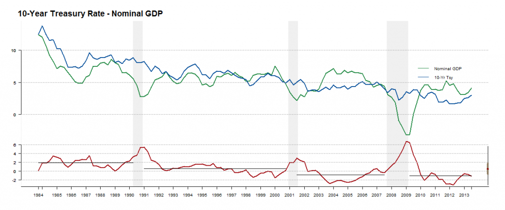
You can see why people liked this idea for a while but don’t talk about it anymore. During the 1991-1999 period the relationship held up pretty well but less so during 2001-2007 and after the financial crisis. I still think this tells an interesting story: easy money in 2003 to 2006? Sounds right. QE and “Operation Twist”? You can see that too.
Over each epoch the average gets lower. The horizontal lines representing the averages are at the following levels: +1.8%, +0.6%, -0.9% and -1.1%. While there are many possible reasons for this, from demographics to technological change, it seems that sourcing money is easier than it used to be. Of course, the government has been creating money out of thin air over the last few years but this trend preceded that.
The code for this chart is available through this gist.