Principal Components Part Three
31 May, 2016 — 4 minIt’s hard to let a good thing go but this is the final post on PCA for a while. It’s about time…past time…you are thinking. There are still a couple of interesting things to explore and we can do so using R (of course!) along with the interest data we get from our friends at the St. Louis Fed. Being the giving person that I am, the code for this post is in this gist.
How Good Of An Approximation Is PCA?
I see a lot of explanations of the math behind PCA but rarely does anyone look at the size of the errors caused by using fewer than the complete set of factors. You probably spend your nights wondering the same thing. Remember the PCA translation of the data is exact if all the factors are used, and becomes an approximation if fewer than the full set is employed. The cool thing about PCA is it gives you an orderly and efficient way if picking out the most important factors.
But getting back to the question of the size of the errors: how big are they? Below is a plot showing the mean absolute error using 1 to 6 factors on our data set of 500+ weeks of data from our rate data set that begins in 2006. Also, it identifies the largest single error in the entire data set by comparing actual rate changes to the approximated changes.
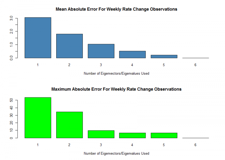
I did a little more coding to produce the time and amount of the largest errors. The number of principal components is in the (unlabeled) first column and the size of the error is the difference between the actual change and the PCA approximation change.
        Date Which.Rate Actual.Chng PCA.Change
1 2007-08-17        6mo     -58.376     -4.633
2 2008-11-21        6mo     -44.698    -10.185
3 2011-08-12       30yr      -9.637    -19.338
4 2008-10-17       20yr      23.915     17.265
5 2008-10-17       20yr      23.915     17.219
You can see that using three principal components is a good tradeoff; the average and maximum errors are reasonable.
Geometry Of The PCA Transformation
The eigenvalues and eigenvectors found from the spectral decomposition of the covariance matrix have an interesting geometrical interpretation. A somewhat practical application is that you can put together a location-dispersion ellipsoid and show the principal axes of the data. You can reliably do this with a covariance matrix because it will be symmetric, and if it is positive the eigenvalues will be greater than zero. If you are doing real work and you have negative eigenvalues, you probably screwed something up.
The chart below shows a scatterplot of changes in 10-year and 30-year interest rates, which are highly correlated, along with PCA factors 1 and 2 which represent a curve shift and change in curve slope.
I cheated a bit and used an eponymous function from the package ellipse to create the points for the ellipse.
The ellipse is set to be the at the 95th percentile assuming the data is normally distributed.
The first and second principal axes are drawn using line segments with the eigenvectors as coordinates.
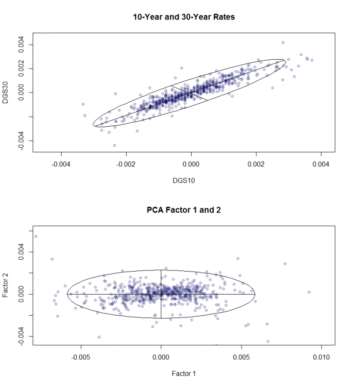
What is interesting about this, you ask? When we talked about how the PCA factors are orthogonal, this is what we were talking about. Instead of being a set of highly correlated points compressed together in a linear way, the PCA factors are uncorrelated. The visual evidence is that the principal axes are orthogonal (at 90 degree angles from each other) and point in the direction of the x and y axes.
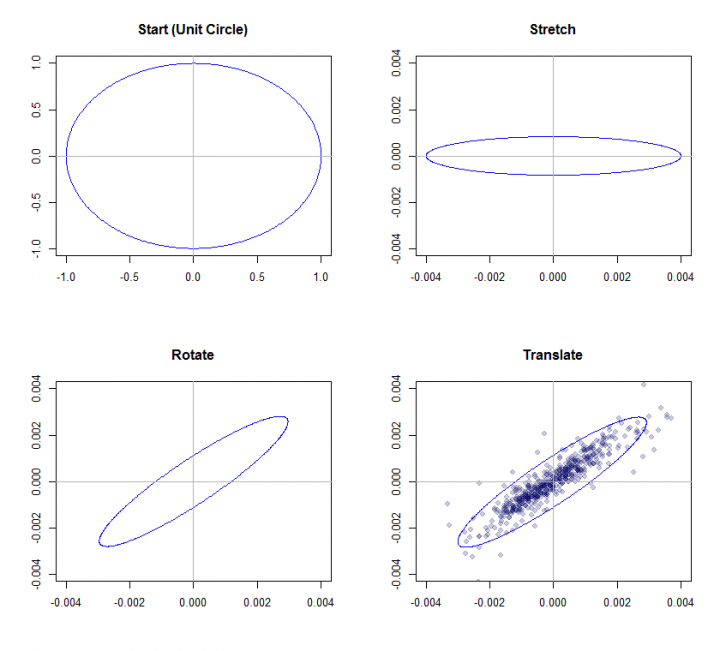
Attilio Meucci’s book Risk and Asset Allocation has a technical but interesting section on a geometrical interpretation of the spectral decomposition. He represents symmetric positive matrices as ellipsoids. If you start with a unit circle, multiplying by a diagonal matrix of \(\Lambda^{1/2}\) will stretch the unit circle, the eigenvectors will rotate it, and finally adding the series mean will translate the matrix. This is in appendix A.5.2 of his book.
The plot below mimics Meucci’s method using the data from the rate change series we described above. It starts with the unit circle, multiplies by the eigenvalues, eigenvectors and series means. The final plot has the data points from the data filled in - notice how it is the same as the plot above.
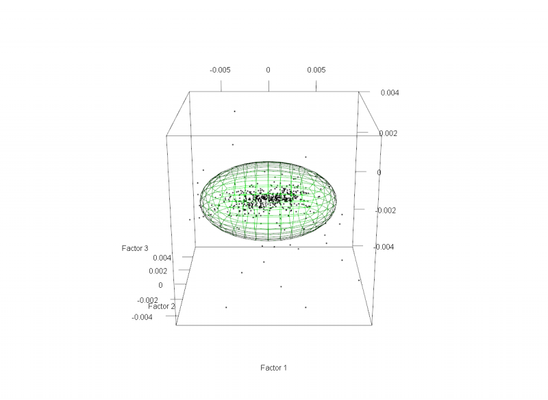
Possibly Over The Top?
Below are 3D images of the rate change series for 2-, 10- and 30-year rate changes and the first three factors of the PCA analysis.
These were made with the R package rgl.
If you run the code from the gist you can look at it from any angle using your cursor to change the viewpoint.
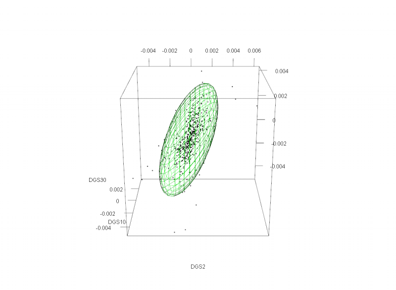
The football-shaped PCA factors show the orthogonality in three dimensions.
Now that is super-useful! More great stuff coming up next time.